Components - Original
Spacer
A reusable space component that has multiple variants. Used in between contents and changes size in different dimentions. *No BG color included
Variant 1: Large 96px (tablet: 64px, mobile, 48px)
Variant 2: Medium 64px (tablet: 48px, mobile, 32px)
Variant 3: Small 48px (tablet: 32px, mobile, 24px)
Variant 3: Small 32px (tablet: 24px, mobile, 24px)
Divider - White Handddrawn Seperator
Used in between contents.
Variant 1: With Container & No Vertical Padding

Variant 2: With Container & Vertical Padding
Variant 3: Full Width & No Vertical Padding
Handdrawn Arrow
Always will be placed in the middle between sections
Variant 1: Placed Left and Larger

Variant 2: Centered and Smaller
TextBlock
A combination of Title and Description. Header can change size between h1~h5
Variant 1: With Heart
Partners
These awesome community organizations are so valuable to our climbing community and our sport! We love giving back wherever possible and are proud to work with these folks.
Variant 2: No Heart
Partners
These awesome community organizations are so valuable to our climbing community and our sport! We love giving back wherever possible and are proud to work with these folks.
H1 with Emphasis
H1 with the Handdrawn Emphasis. The Emphasis changes size according to the text length.

Text 1
Text 2
H1 with Handdrawn Circle
The Circle changes sizes according to the text length.

Join us at our
Next Event!
H1 with Question Mark
Usually used in FAQ
Frequently
Asked Questions

H1 with Underline
You can choose to do 1 line or 2 lines. You can add the handdrawn line anywhere in Text1, 2 or 3 and the line will stretch to the length of the text.
Variant 1: Line Type 1
Text 1
Text 2
Text 3


Variant 2: Line Type 2
Text 1
Text 2
Text 3
Variant 3: Line Type 3
Text 1
Text 2
Text 3
Heading with Heart
You can freely change the H1 size from H1~H5
Text Title

Dual Container
2 Column layout for text and image. Heading size can also be changed from h1~h5.
Variant 1: Text is Left Side
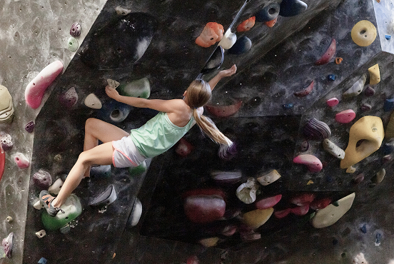
Bouldering
Bouldering is a style of climbing that focuses on short routes called "problems." Using colorful hand- and footholds, climbers scale walls that are 10–17 feet high without ropes or harnesses. Thick padded mats and proper fall technique help reduce the risk of injury. Bouldering can be enjoyed independently or with friends, making it a fun, accessible way to climb for a wide range of experience levels.
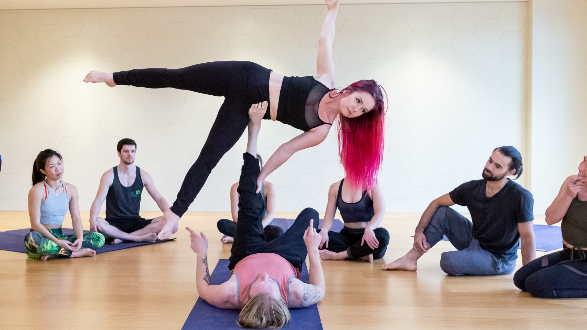
Yoga is available at the Hive North Shore location, included with your day pass or membership purchase. Learn more and book a class.
Variant 2: Text is Right Side
Route
Climbing
Bouldering is a style of climbing that focuses on short routes called "problems." Using colorful hand- and footholds, climbers scale walls that are 10–17 feet high without ropes or harnesses. Thick padded mats and proper fall technique help reduce the risk of injury. Bouldering can be enjoyed independently or with friends, making it a fun, accessible way to climb for a wide range of experience levels.
Yoga is available at the Hive North Shore location, included with your day pass or membership purchase. Learn more and book a class.
Dual Container - Double
2 Column layout for text and image x2. Includes the white seperator in the middle
Variant 1: Base
Bouldering
Bouldering is a style of climbing that focuses on short routes called "problems." Using colorful hand- and footholds, climbers scale walls that are 10–17 feet high without ropes or harnesses. Thick padded mats and proper fall technique help reduce the risk of injury. Bouldering can be enjoyed independently or with friends, making it a fun, accessible way to climb for a wide range of experience levels.
Yoga is available at The Hive North Shore location, included with your day pass or membership purchase. Learn more and book a class.
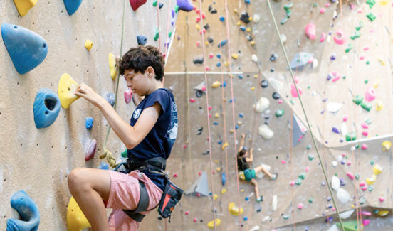
Roped Route Climbing
Route climbers ascend taller walls using a harness and rope system for safety. Climbers follow color-coded routes with set difficulty levels (grades). The safety of the climber is supported by a partner (belayer) or an auto belay device that manages the rope attached to the climber through a system connected to the wall.
Belaying requires additional equipment, skills, and knowledge, to be responsible for the safety of the person on the other end of the rope. Route climbing emphasizes endurance, technique, and trust, making it perfect for those looking to conquer greater heights.
Variant 2: Flip Sides
Bouldering
Bouldering is a style of climbing that focuses on short routes called "problems." Using colorful hand- and footholds, climbers scale walls that are 10–17 feet high without ropes or harnesses. Thick padded mats and proper fall technique help reduce the risk of injury. Bouldering can be enjoyed independently or with friends, making it a fun, accessible way to climb for a wide range of experience levels.
Yoga is available at The Hive North Shore location, included with your day pass or membership purchase. Learn more and book a class.
Roped Route Climbing
Route climbers ascend taller walls using a harness and rope system for safety. Climbers follow color-coded routes with set difficulty levels (grades). The safety of the climber is supported by a partner (belayer) or an auto belay device that manages the rope attached to the climber through a system connected to the wall.
Belaying requires additional equipment, skills, and knowledge, to be responsible for the safety of the person on the other end of the rope. Route climbing emphasizes endurance, technique, and trust, making it perfect for those looking to conquer greater heights.
Highlights Section - 3 Items
By default, this section has 3 empty "slots" for NavCard - Highlight Component. *The 1st Slot is filled in as an example.
Technically, any component can be inserted, but we only have the design for NavCard Highlight Component.
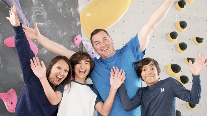
Our Community


Highlights Section - 4 Items
By default, this section has 4 empty "slots" for NavCard - Highlight Component. *The 1st Slot is filled in as an example
Technically, any component can be inserted, but we only have the design for NavCard Highlight Component.
Explore
The Hive
LinkBlock - with Arrow Link
Usually used when prompting to link to other pages. Show and Hide Heart is an option
.svg)

Subscription Section
This is a Group component that accepts a Slot. In this case we only use it for "Subscription Form - General" and "Subscription Form - Youth".
Example 1: Default Subscription Section Component

Stay in the Loop!
Subscribe to our newsletter to receive exclusive offers, latest updates and news from the Hive.
Example 2: Subscription Section with Subscription Form in Slot
Changed Title
Subscribe to our newsletter to receive exclusive offers, latest updates and news from the Hive.

Email confirmation sent!
To complete the subscription, please click the link sent in the confirmation email. If you don’t see it, check your spam folder or try subscribing again.

Image Overlay
A simple Image Component. Used for ThreeCards as a slot. It has the same height size as the MiniCard Component. No Links
Variant 1: Image with Overlay
Variant 2: Image without overlay
ThreeCard
A 3-Column Grid for MiniCard and ImageOverlay Component. Default is empty, but you can add as many Cards as you like in the "ThreeCards Grid Slot", and it always stay 3 in a Row.
Default: No Cards in Slot
Life at the Hive
Example 1: Added 3 MiniCard with Overlay Variant
Life at the Hive
Example 2: Added 3 Image Overlay Component
Title can be changed
Waiver Button Code Embed - For RichText
This is just button specifically for opening the Waiver Modal.
*Same as the Code Embed above,
It will only open the Waiver when there is a header, so it will open the model in this page

Icon and Text Container
Simple Icon and Description. Used in Amenities Section of Locations page
